Cycle Friendly Places
Brand Identity
Cycle Friendly Places is a Cycling UK accreditation scheme promoting cycle-friendly accommodation and hospitality providers across the UK.
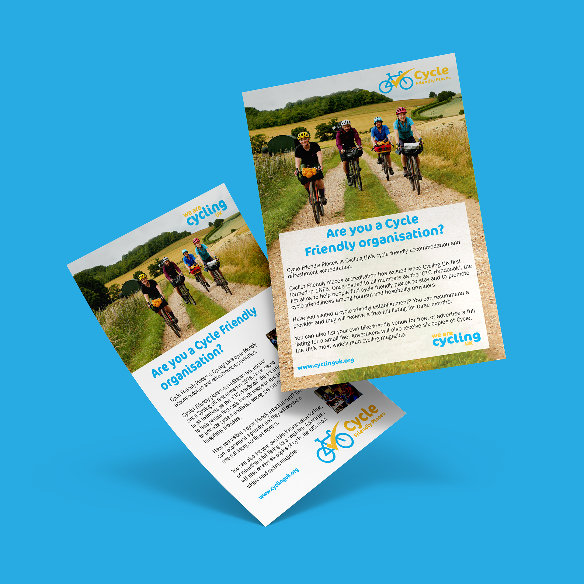
This project was completed during a one-week work experience placement at Morgan Creative, where I was tasked with developing a logo and promotional flyers for the scheme. The identity was designed to sit naturally alongside Cycling UK’s existing brand while giving Cycle Friendly Places its own recognisable visual presence.
Year
2020
Placement
Morgan Creative
1 Week Work Experience
Role
Graphic Designer
Deliverables
Logo
Visual Identity
Promotional Flyers
Print Design
Visual Identity
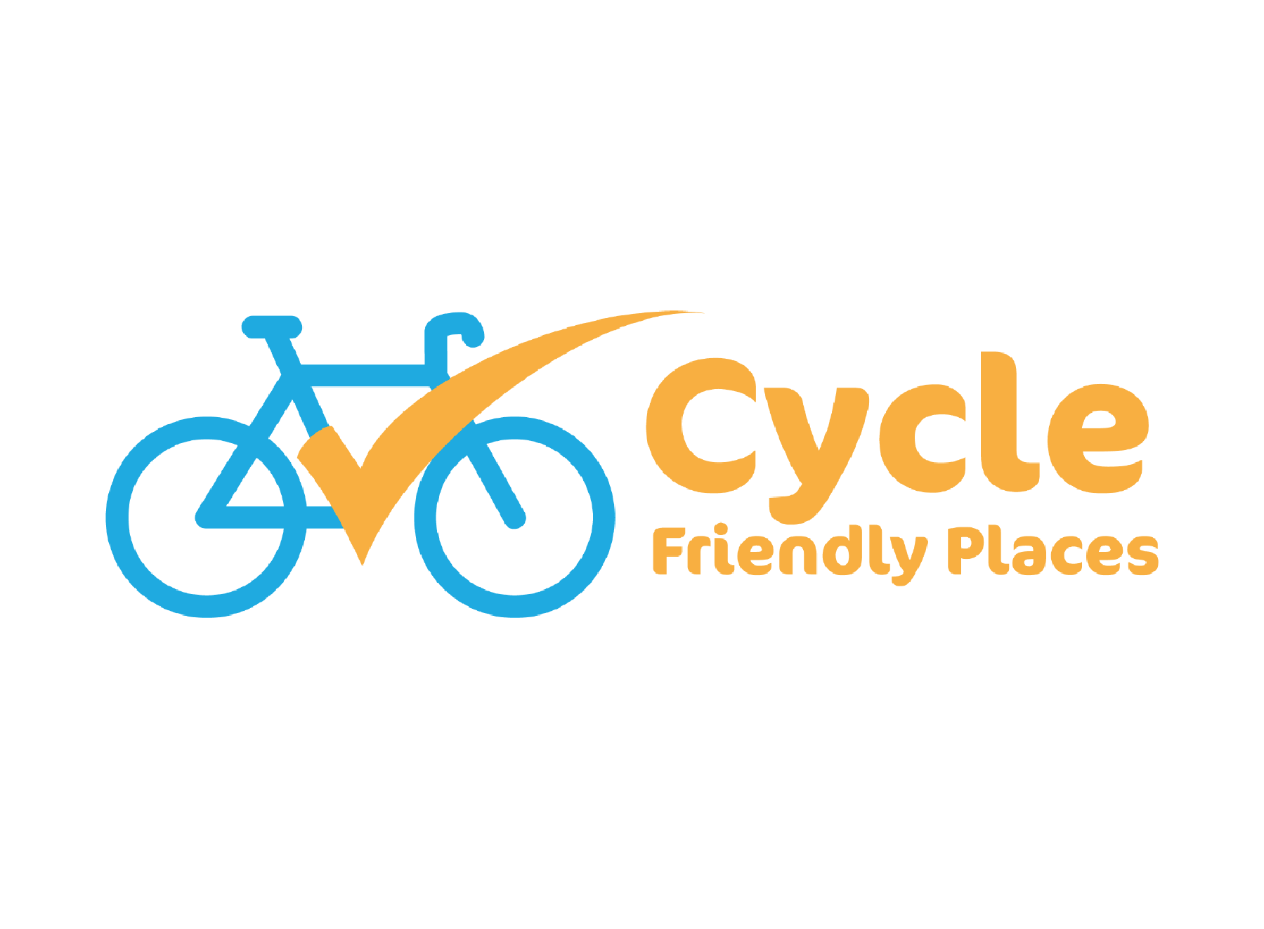
The identity builds on Cycling UK’s established blue and orange palette and typography while giving Cycle Friendly Places its own recognisable visual presence. A simplified bicycle combined with a forward-moving tick represents cycling, accreditation and positive recognition. The identity was extended across two promotional flyer concepts, exploring different layouts and imagery while maintaining a clear connection to the wider Cycling UK brand.