DISCONNECT
Campaign Design
DISCONNECT is a self-initiated social awareness campaign exploring the negative impact of excessive social media use on young adults. The project encourages people to step away from their screens, reconnect with reality and become more conscious of their relationship with social media.
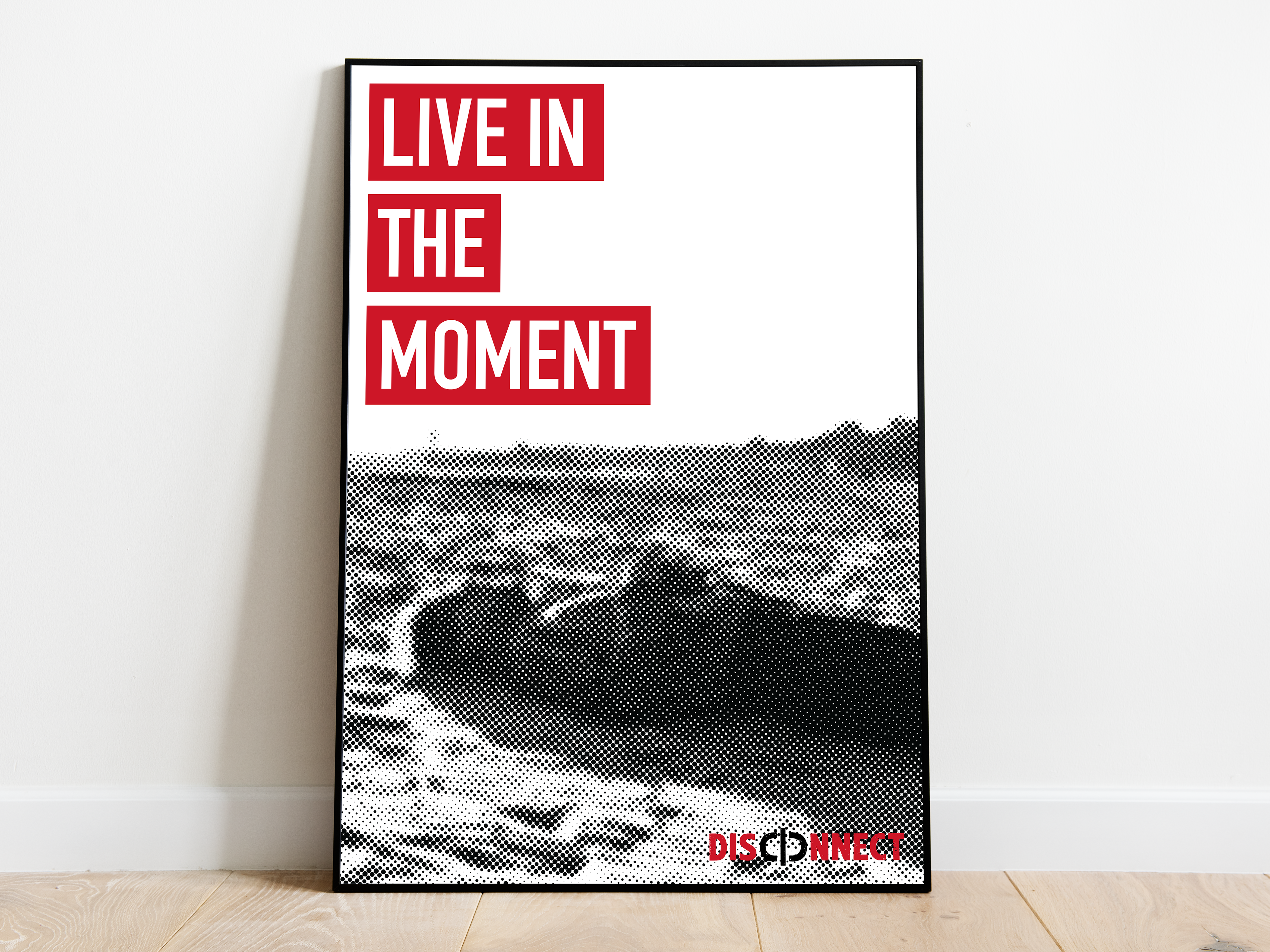
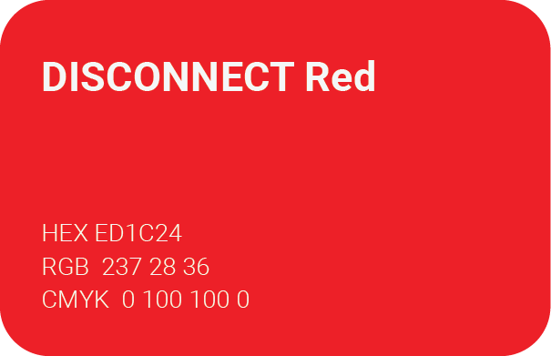
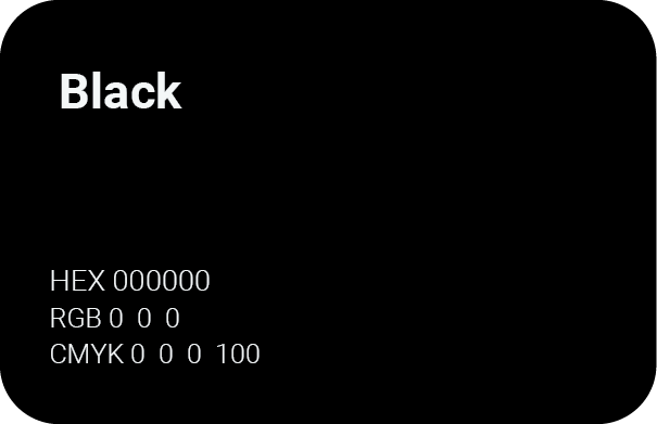
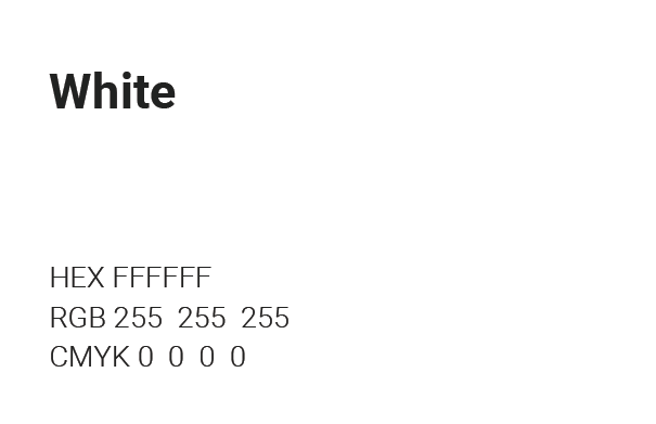
The identity combines bold typography, a limited red, black and white colour palette, and provocative campaign messaging. Developed through digital design and physical experimentation, the visual system was applied across a poster campaign and apparel.
Year
2024
Project Type
Final Major Project
Deliverables
Brand Identity
Poster Campaign
Apparel
Techniques
Typography
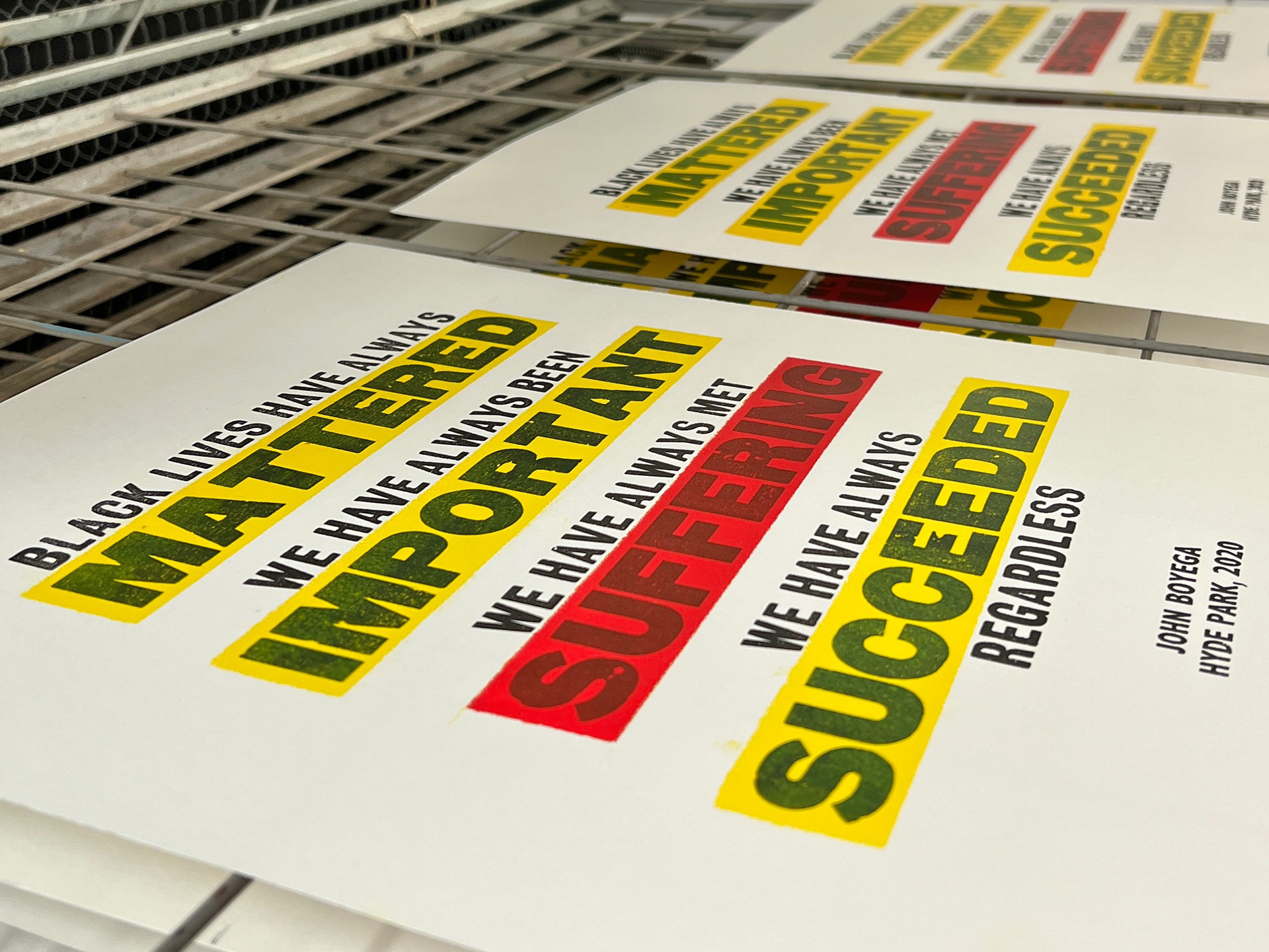
Letterpress
Spray Painting
Digital Design

Logo
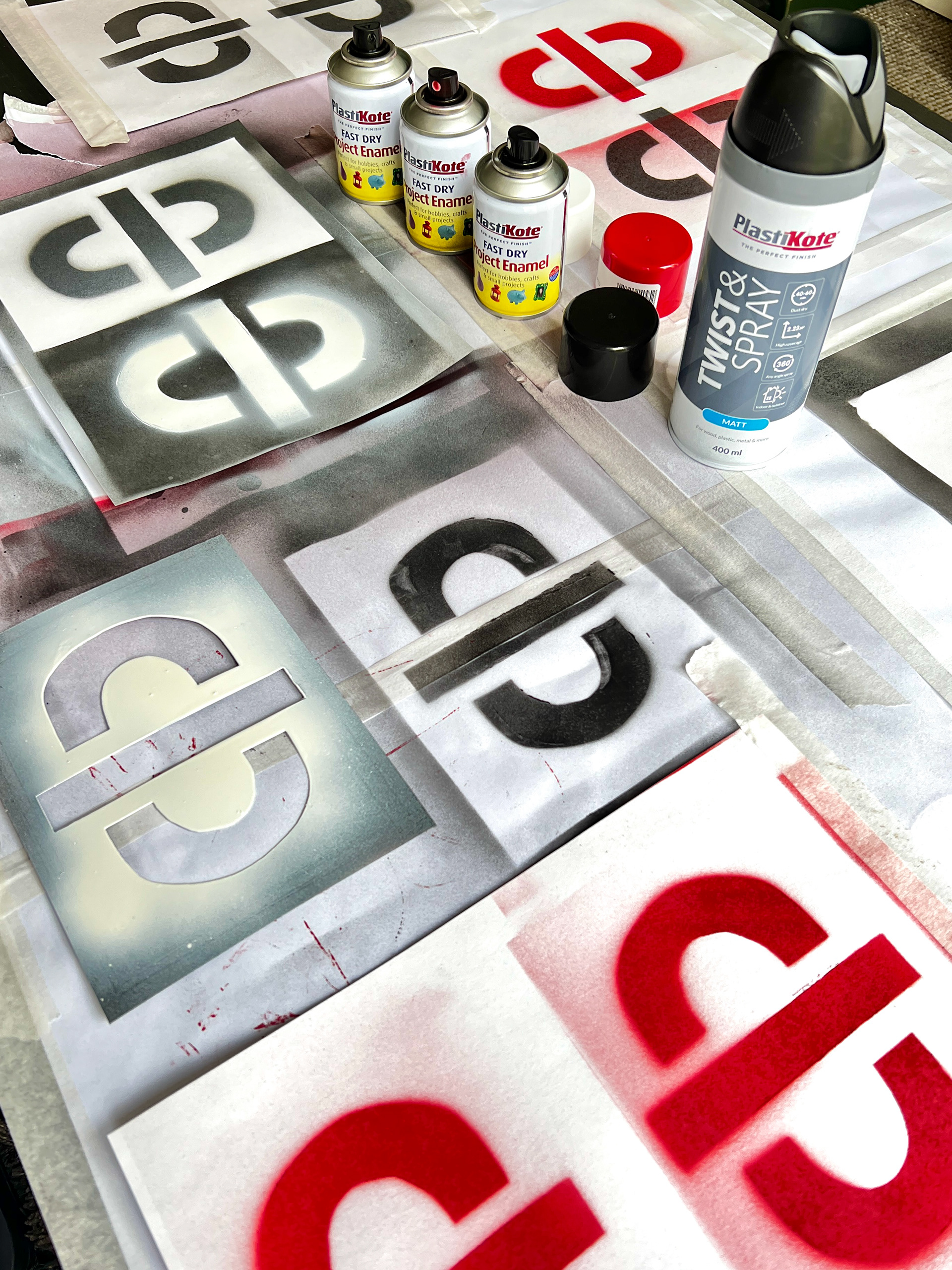
The DISCONNECT wordmark incorporates a power symbol to represent switching off and stepping away from social media. The divided symbol reinforces the idea of disconnecting while creating a distinctive and recognisable identity.
Visual Identity
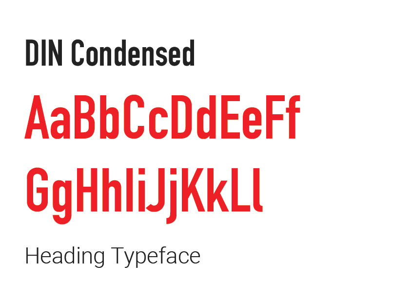
A bold red, black and white palette creates a direct, high-impact visual language, while DIN Condensed gives the campaign a strong editorial character. Its narrow proportions and bold appearance support large-scale messaging and create a consistent visual hierarchy across the campaign.
Process & Experimentation
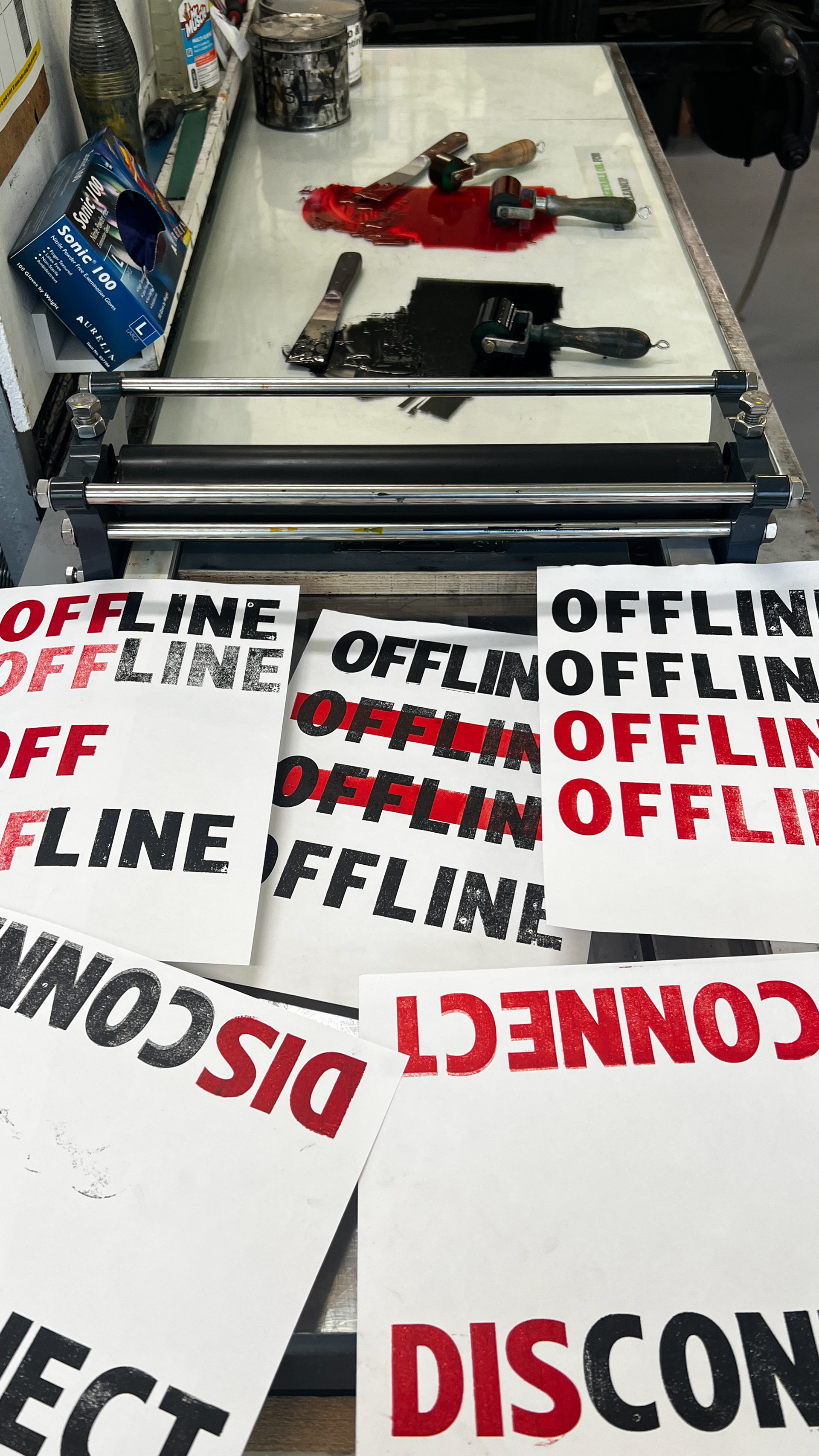
The identity was developed through a combination of digital design and hands-on experimentation. Letterpress, spray painting and typographic testing were used to explore different textures, compositions and ways of communicating the idea of disconnecting from social media.
Poster Campaign
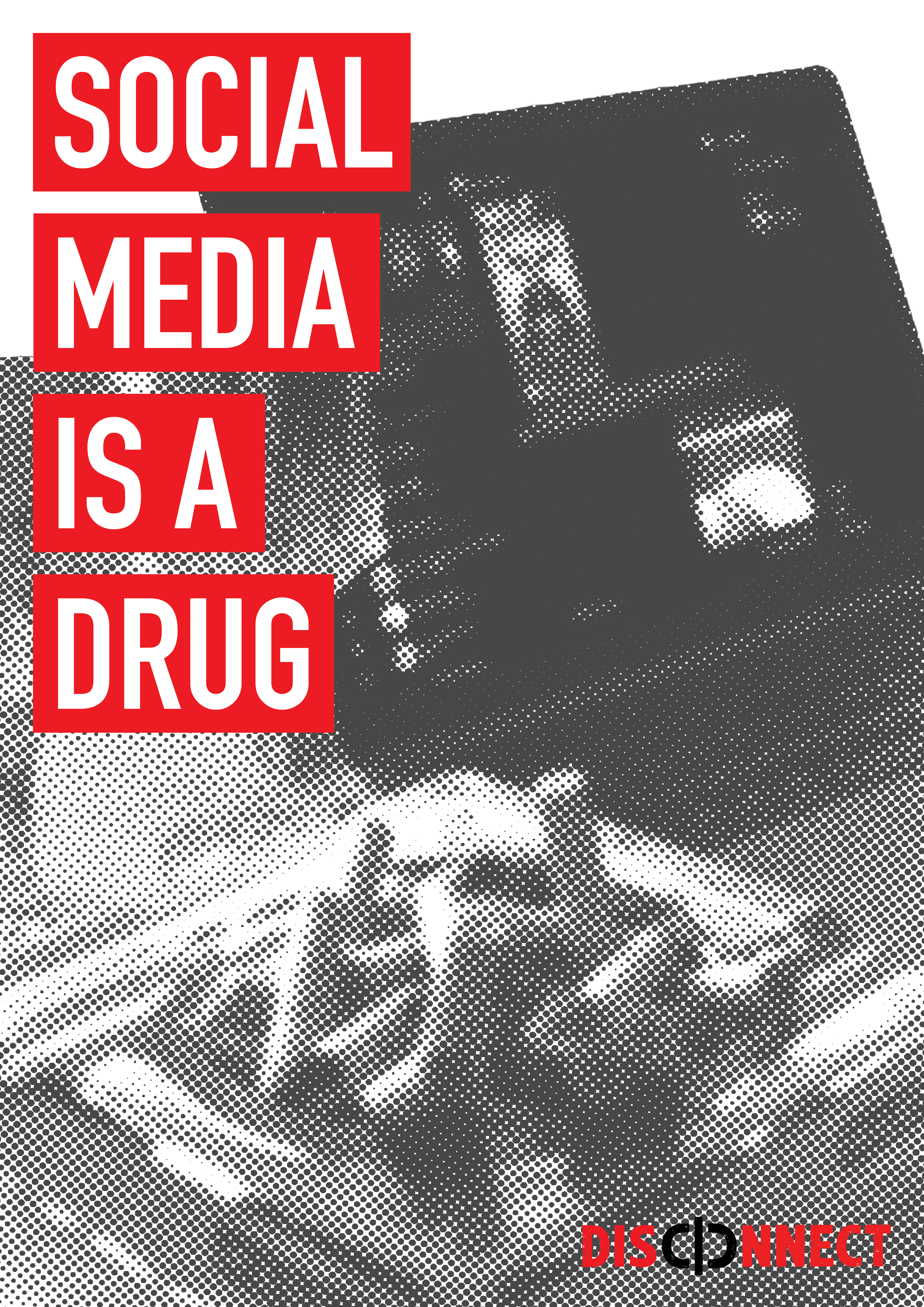
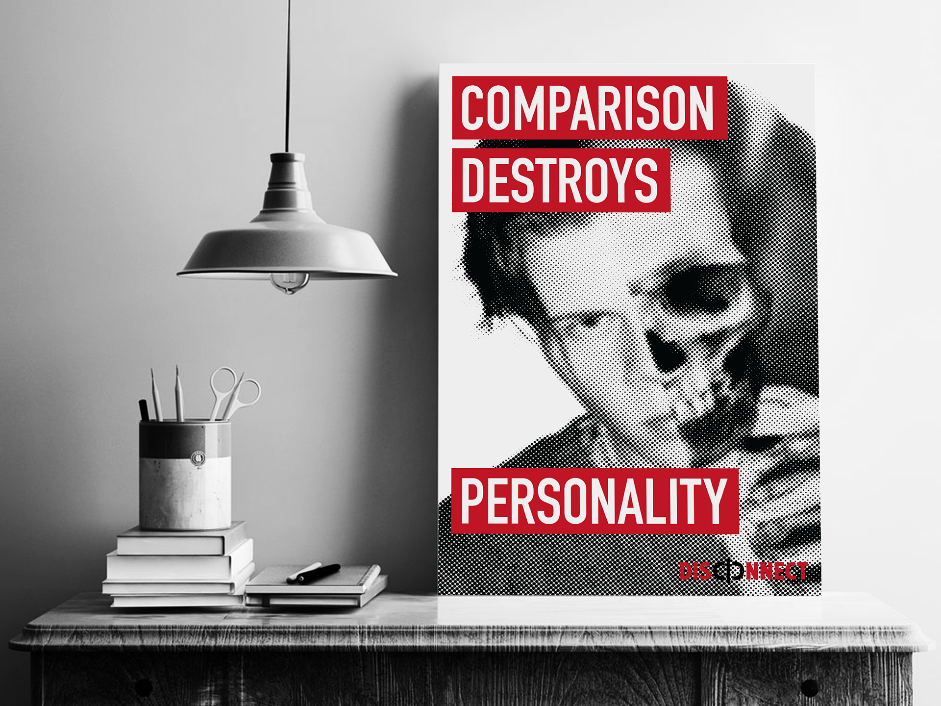
A series of posters uses bold typography, imagery and direct messaging to highlight different effects of excessive social media use, including comparison, addiction and becoming disconnected from everyday life.
Apparel
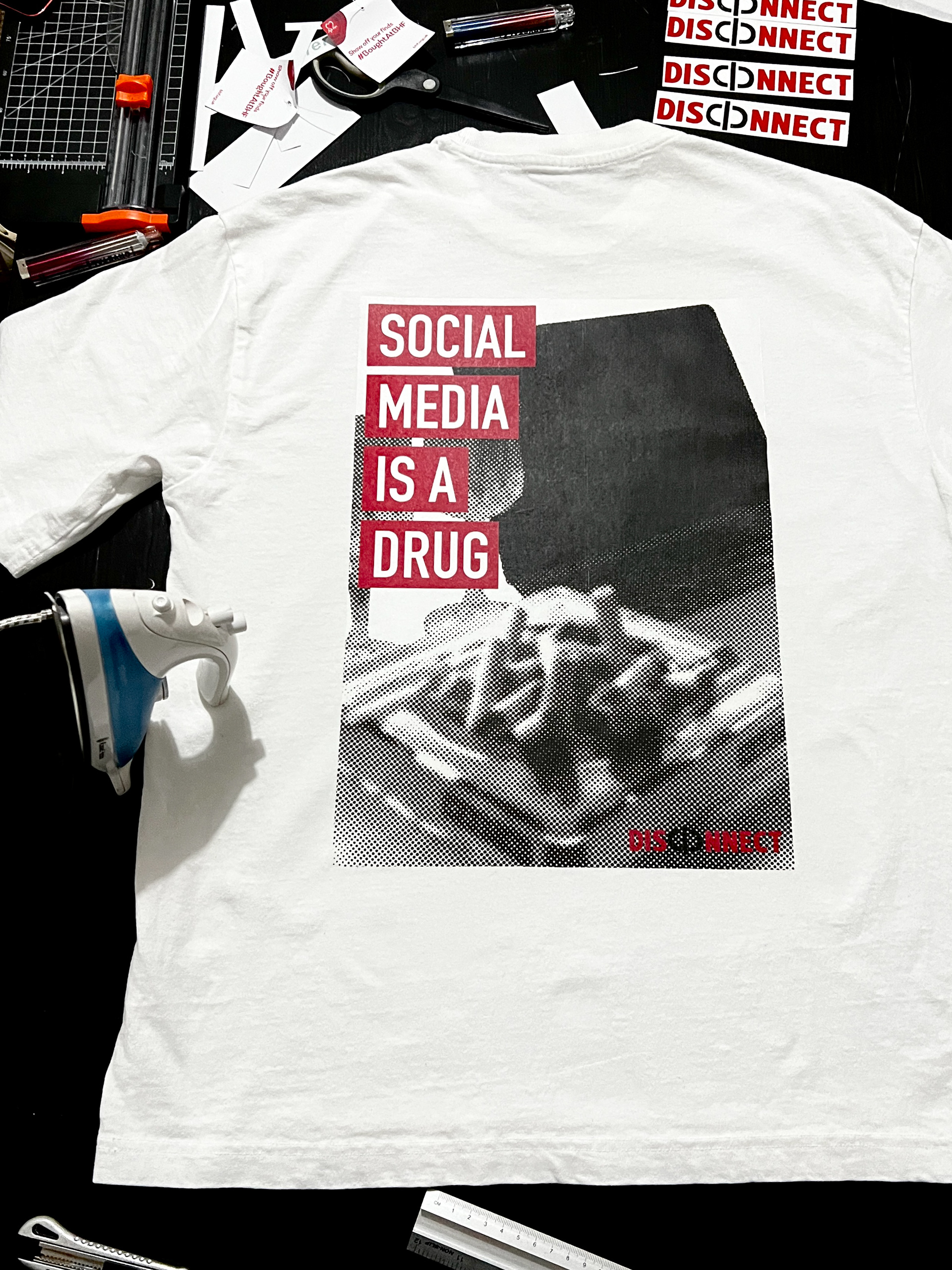
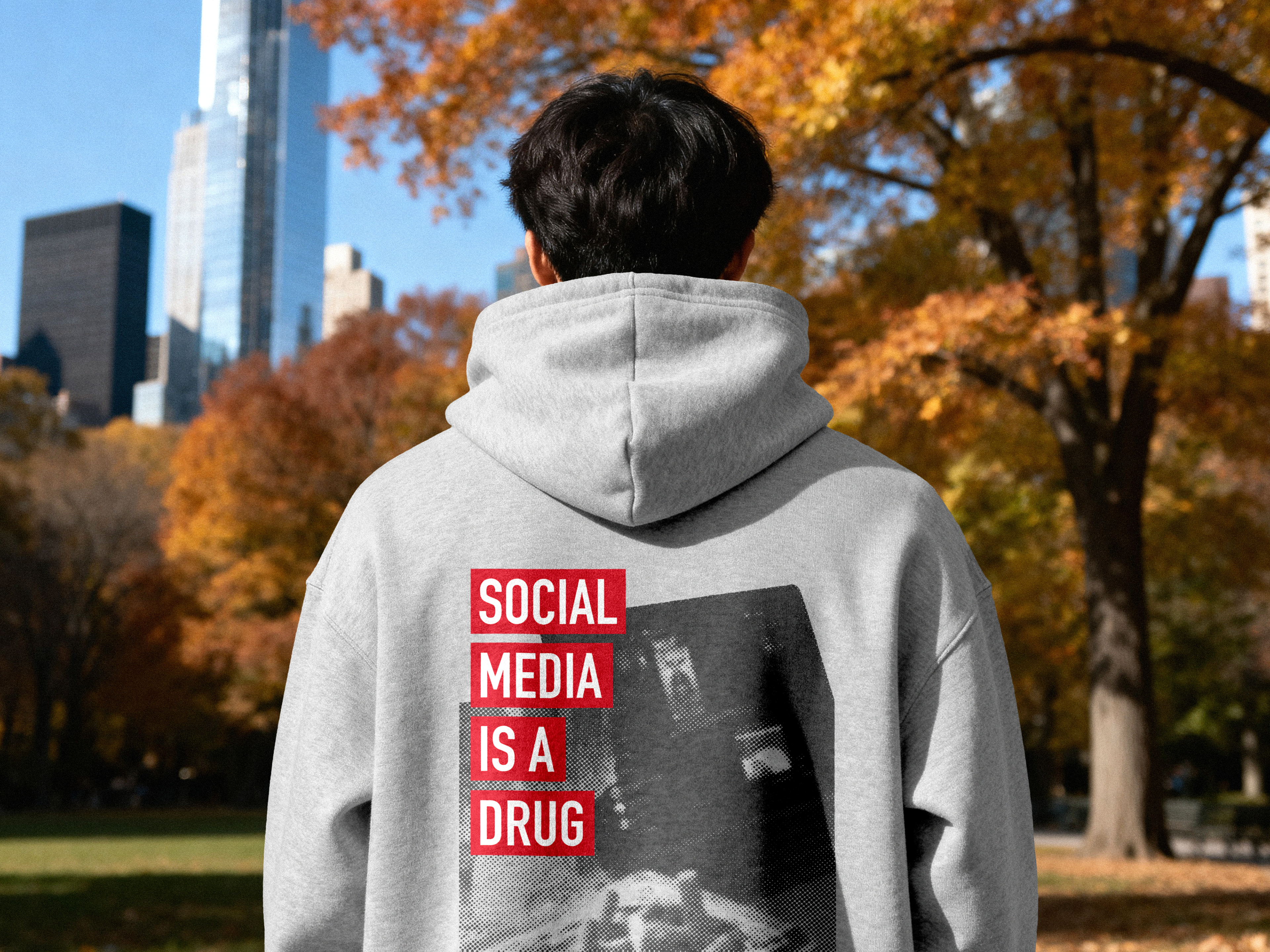
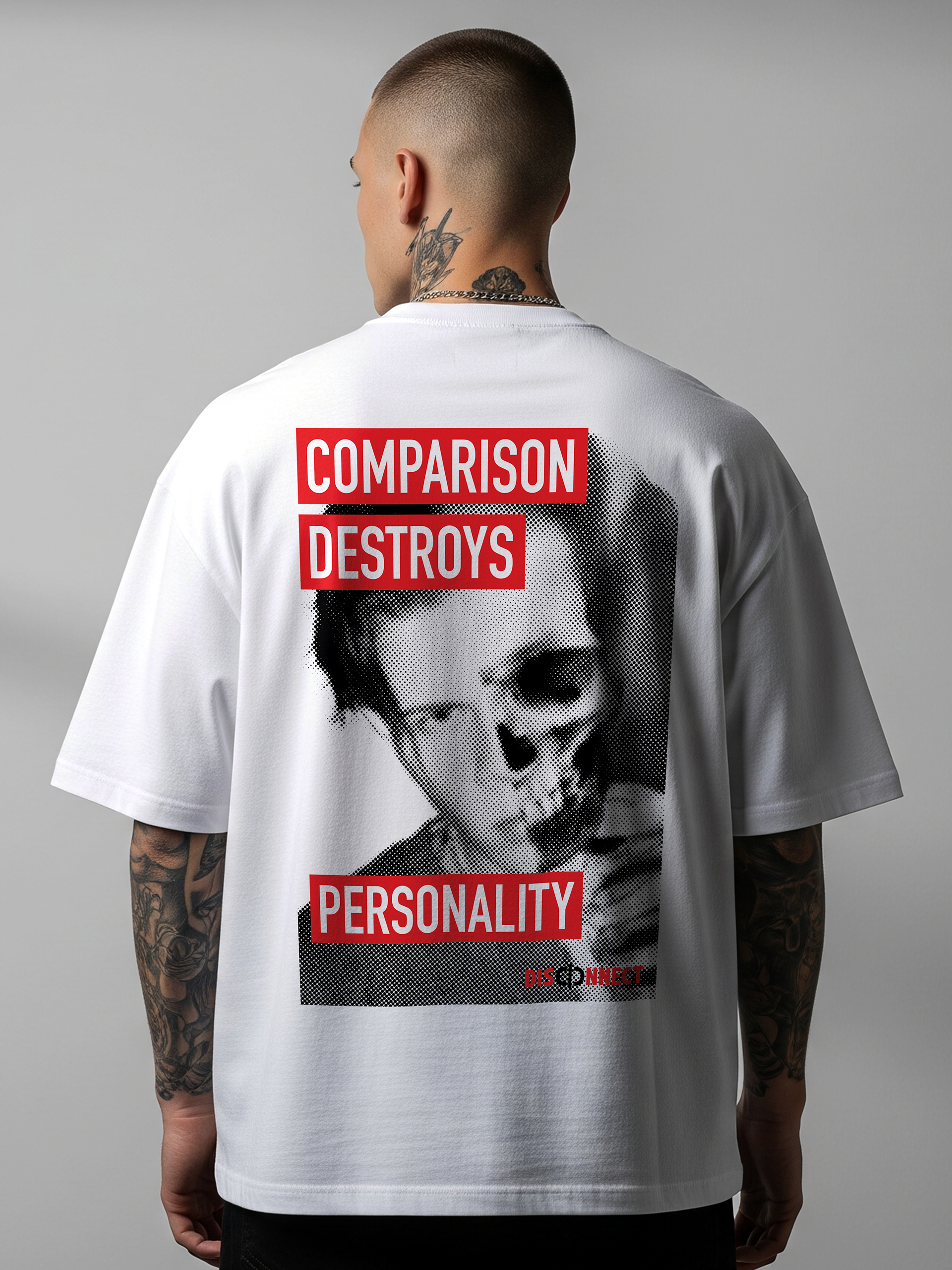
The campaign identity was extended into apparel, taking its visual language and messaging beyond traditional poster formats and into a context relevant to the target audience.